Now that the Beijing Olympics is drawn to a close, London's task of building and preparing for the next Olympics officially begins. As expected, Beijing treated the world to a spectacular presentation in the closing ceremonies. But for us the key moment is the actual handover to the current mayor of London, Boris Johnson, of the Olympic flag and the short very modern 8-minute presentation for London's 2012 Olympics. A stark contrast to the formal, dramatic and epic proportions of the host's show.
Boris gave this rousing but funny speech (true to British nature) after the ceremonies. Click on here and have a listen to what he says.
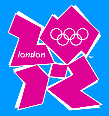
See this logo for the London Olympics? You don't know how much I hate it. The colour is absolutely jarring. It certainly hurts my eyes. Characters look like jagged jigsaw puzzle pieces that are not fitted together. At first glance I couldn't make out what it says and tries to convey. I don't like it at all. Doesn't it look like a blown up something that was jumbled up together? I do realise now that London Olympics is trying to project a modern and 'cool' image. They could have done the same with a nicer logo with clean lines, equally bright colours and most of all readable text. Mr. Boris Johnson, this would be your next work assignment - replace the London Olympics logo ASAP !!
select * from thoughts_array where it_contains = 'diary' or consists_of = 'travel';
About Me
Friends & Favs
- My Food Blog
- Ajay's Writings On The Wall
- AMoores
- April Journeys
- Baby Rambutan
- Beautiful Mind
- the Best Thing In Life Is Free
- Buddha Dharma
- Crystalinks
- Dagboek van Thesserie
- Deja Brew
- Euphonies In My Solitude
- Kwentong Tambay
- Manilena
- Mec As Mom
- Mecomposing
- MissT-The DutcheD Pinay
- My Hideaway
- Now What, Cat?
- Our Kitchen
- Pansitan ni Ate Sienna
- Parallel Universes
- Pinay Expat
- Sassy Lawyer
- Serendipity
- Tagay Mo Pre!
- Turo ni Tito
- The Walk Of Ten Thousand Steps
- Wifely Steps
- Writings On The Wall
Contact
Labels
celebrations
computers
concerts
education
everyday life
family life
festivals
friends
gifts
health
humour
literature
Litratong Pinoy
movies
music
musings
news
pets
photography
rants
raves
relatives
reminiscing
science
sports
techie
theatres
Travel - Europe
Travel - London
Travel - Philippines
Travel - Switzerland
Travel - UK
TV shows
work
Sunday, August 24, 2008
Subscribe to:
Post Comments (Atom)


4 comments:
Boris is a joke, isn't he? I also agree with you about the logo. So unbelievable! Thanks for dropping by my site, Celia! :)
are they trying to be picasso with this logo? hehe.
by the way, hope you don't mind...but i just tagged you! :)
omg...i just realized the pink stuff is supposed to read "2012"! haha.
not a fan of the logo too. the 2010 winter olympics will be here in vancouver.
lasedweb.net/tbj
rumplestilskin.wordpress.com
Post a Comment